Event Planning
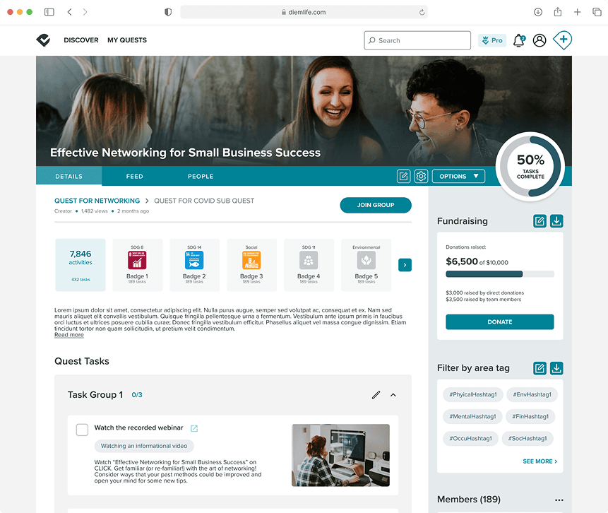
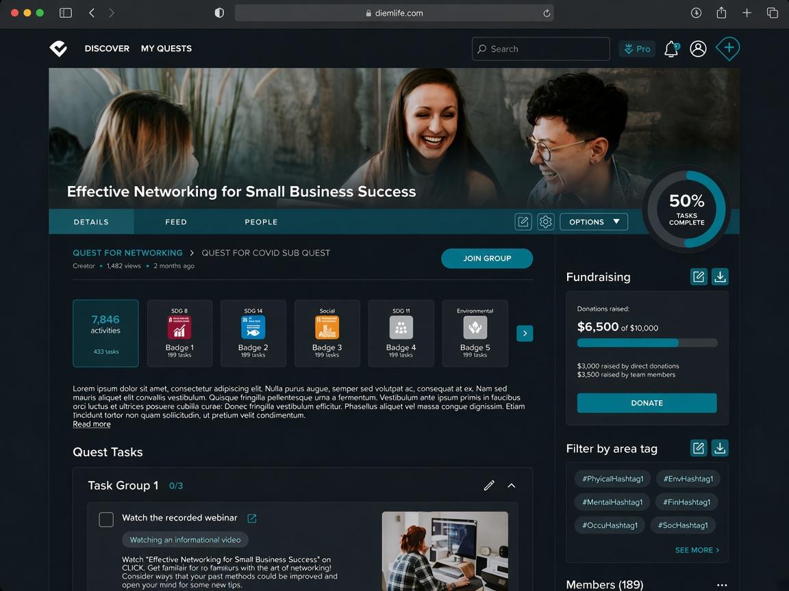
Outcome Overview
Average user engagement rate increased by 25% and raised upwards of $100,000 in funds
As a product designer at DIEMlife, I helped 4+ organizations run 10+ events, raising over $100,000 and boosting user engagement by 25%.
01. Post Activities and Engage with the Community
Users can share their activities and engagement with tasks in DIEMlife events, allowing them to get more involved and help the community grow.
02. Donation Flow
Users are motivated to donate to support others in achieving their goals, granting creators enough funds to organize events. The redesigned interface streamlines the donation flow, giving users an elevated experience as they make an impact.
Context
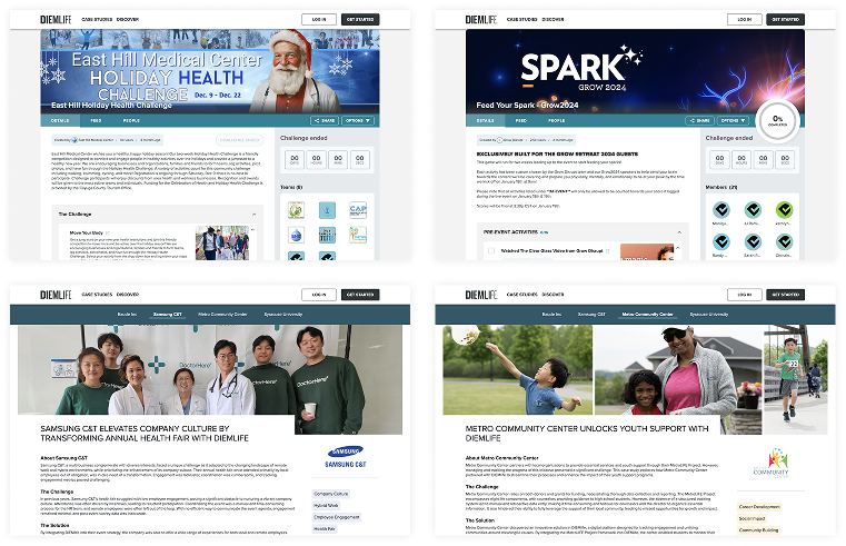
DIEMlife is a platform that improves employees' well-being and productivity through events.
As remote work grew after the pandemic, employee engagement declined. DIEMlife introduced "Quest," a tool for companies to organize events where employees join solo or in teams, complete tasks, and share their activity. Along the way, participants are encouraged to donate and help others reach their community goals.
Onboarding
Employees
AnalysisReport
Tasks
Fundraising
Networking
Research
Quick statistics on current user engagement
Quest, the main tool companies use to organize events, had low retention and engagement, leaving clear room to better meet company goals.
63%
user retention rate
45%
task completion rate
6%
user donation rate
Why did users fail to actively engage with the platform?
To understand the numbers, I ran 11 in-depth interviews and collected 153 survey responses with past users, which revealed two main insights:
01. Lack of call-to-action to get involved on the platform
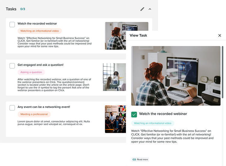
Checking off tasks was users' only way to engage, so they got bored quickly. With few online activities, they never formed a connection with the platform and wanted more ways to interact with other participants.
80% users reported lack of motivation to complete tasks
02. 15% of the users need financial support to achieve their goals
15% is a small share, but across participating users it is a real group who stay motivated and still cannot engage. Donations are too low to cover what they need.
17 out of 20 fundraising events are underperforming
Unpack insights to an actionable question...
How might I reconstruct the platform's features to ensure employees are actively engaged and adequately funded to reach their objectives?
Design Ideation
North Star: Social elements is the key to enhance community engagement
Checking off assigned tasks was not enough. The research pointed to a community that feels like working in person, so I designed two approaches: share experiences, make connections, and support each other while pursuing individual goals.
revamped user flow
- Social elements added
- Previous
Enroll the event
Join tasks
Add Wallet
Check off tasks
Donate to the event
Community continue to exist
- Social steps come before the donation.
- Activities give each event its own experience.
- The community stays after the event ends.
01. New social feature: Activity Posts
Activity posts let people share task progress with others in the same event. Research showed that is how they socialize and find people with the same interests.
02. Donation flow redesign
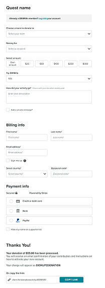
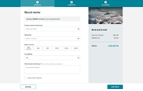
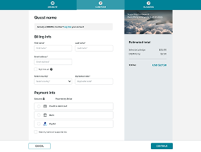
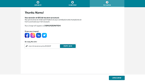
Raising donations helps people who cannot fund their own goals. I split the flow into clearer steps, added more ways to customize a gift, and let donors share the impact they made.
previous flow
Donate amount
Tip DIEMlife
Billing info
Payment info
Receipt
redesigned flow
Step 1
Donate amount
Tip DIEMlife
Step 2
Billing info
Payment info
Step 3
Receipt
Share impact
- All in one page
- Hard to trace information
- Separate into logical steps
- Save mental stress of overwhelming information
- Prevent interface get extremely long
Step 1
Step 2
Step 3
Iteration
Users appreciate the social elements added, but there are some situations to improve
After ideation I ran 7 rounds of testing. Everyone preferred the clearer screens. I then iterated in three areas: Visual, Interaction, and Functionality.
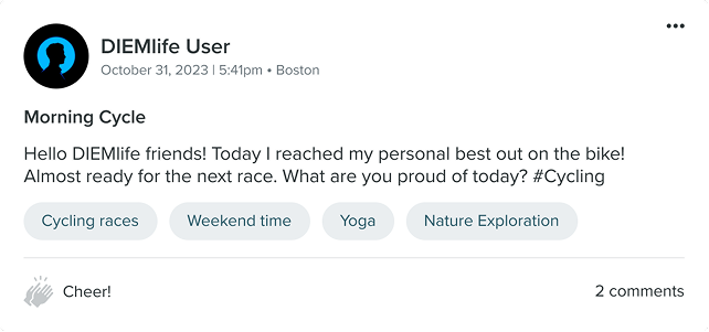
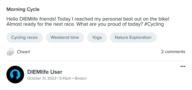
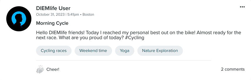
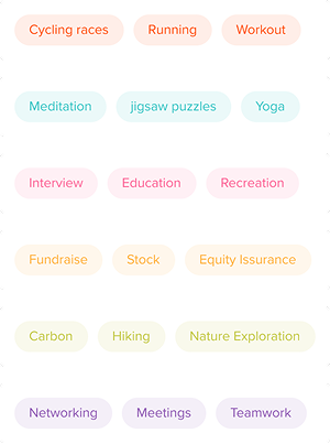
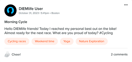
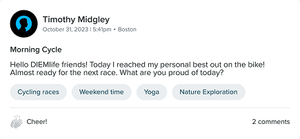
Visual: Crafting the ideal feed post card
After someone posts, the feed card shows the activity and the responses. These cards shape most of how the feed looks.
step 1: choosing the post layout
Small + Header on top
Small + Header on bottom
Large + Header on top
step 2: unifying colored tags
Interaction: Maximizing donation efficiency
Dropdowns hid the amount and tip choices, so donating took extra clicks. I replaced them with a sliding bar that keeps every option visible and easy to customize.
Previous
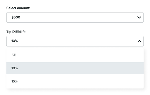
- Unable to see all options at first
- Require extra clicks to complete
After Iterations
- View all options clearly
- Provide customized options
Functional: Sharing impact after donation
The step-by-step flow worked, but the ending gave people no way to share their gift. I added a share step so a donation can reach the rest of the community.
step 1: modal window vs. full screen
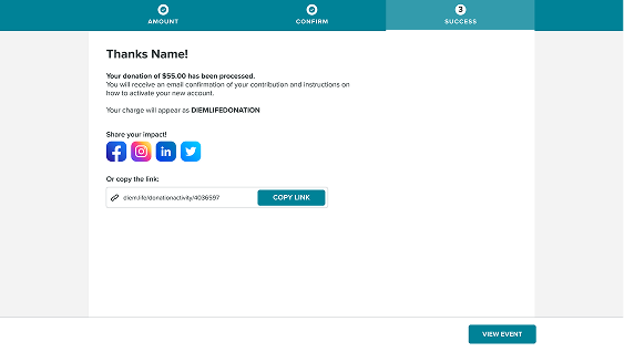
- Overlooks sharing section
- Mixed with thank-you notice and receipt
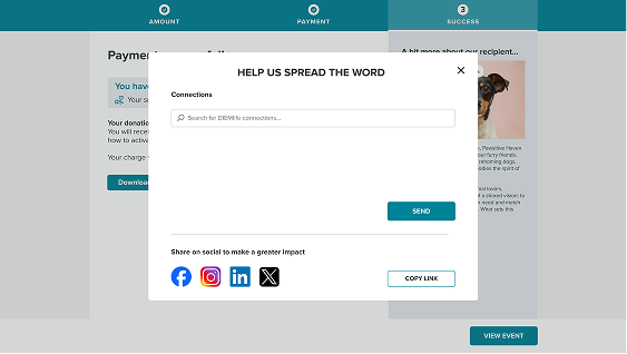
- Attentions for important call-to action
- Independent section to perform actions
step 2: spread words inside and out of the community
Measuring Success
After the social redesign, 4+ partners hosted 10+ events on DIEMlife. Engagement rose 25%, and the events raised over $100,000.
Reflections
01. The key is to integrate online and offline experiences
DIEMlife gives companies a place to launch events and build connections, but employees still have to carry those activities offline. I need to connect the two experiences, and I am designing the mobile app to make that easier.
02. Potential data analysis and display features
Employees want to see their own progress, and companies want a clear measure of engagement. A dashboard can meet both needs, and it will take backend work with engineering.